180,000 React Icons
Free icons for React
Free icons for React
Free icons for React
✔ Copy/paste JSX code in your React editor
✔ Massive, consistent 45+ React icons sets
✔ Apply CSS currentcolor and responsive sizing
✔ Massive. consistent 45+ React icons sets
✔ Set CSS currentcolor for
✔ Copy/paste JSX or SVG code in your editor

Used by the best teams Since 12 years

Used by the best teams Since 12 years
Used by the best teams Since 12 years
Why don't we offer npm with Streamline's React icon library?

Complexity
For developers unfamiliar with the particular npm icon package, there's a learning curve. Direct JSX icons are simpler and easier to use.

Bundle Size
npm packages might include many icons, and if not used judiciously, you could end up bundling icons you don't need, bloating your application size.

Dependencies
Adding npm packages means more dependencies to manage, bringing potential risks such as deprecation, vulnerabilities, or conflicts with other packages.
Why don't we offer npm with Streamline's React icon library?
Complexity
For developers unfamiliar with the particular npm icon package, there's a learning curve. Direct JSX icons are simpler and easier to use.
Bundle Size
npm packages might include many icons, and if not used judiciously, you could end up bundling icons you don't need, bloating your application size.
Dependencies
Adding npm packages means more dependencies to manage, bringing potential risks such as deprecation, vulnerabilities, or conflicts with other packages.

Flexibility
Direct JSX offers granular control over icon properties. Using npm packages could restrict certain customizations or make them more cumbersome.

Performance
Direct JSX icons are inherently part of your React components, potentially offering better performance. npm packages might load or process icons in a less optimized manner.

Overhead
For projects needing custom or modified icons, direct JSX icons ensure consistency. Using npm packages might introduce a mix, potentially causing inconsistencies.
Flexibility
Direct JSX offers granular control over icon properties. Using npm packages could restrict certain customizations or make them more cumbersome.
Performance
Direct JSX icons are inherently part of your React components, potentially offering better performance. npm packages might load or process icons in a less optimized manner.
Overhead
For projects needing custom or modified icons, direct JSX icons ensure consistency. Using npm packages might introduce a mix, potentially causing inconsistencies.
Which React icon set will you pick?
We have 24 sets that are free forever. You can also try out our premium icons for free.


Which React icon set will you pick?
We have 24 sets that are free forever. You can also try out our premium icons for free.
Which React icon set will you pick?
We have 24 sets that are free forever. You can also try out our premium icons for free.
Advantages of choosing React icons from Streamline
More (usable) choice
We consistently release new, massive icon sets and lead the trend. When others released a single Sharp icon set, we already had four variations of sharp icons. Because our sets are large, you don't have to mix and match inconsistent sets together.
Best React icons library
It's a big claim to make. At Streamline, each icon has been crafted over 12 years by a single team. Our customers have tried every alternative on the market and eventually gravitate to Streamline. It's simply hard to find icons as good as Streamline. Even our free sets have been voted as superior to the custom-made icons of billion-dollar companies.
Cleaner hand-off process
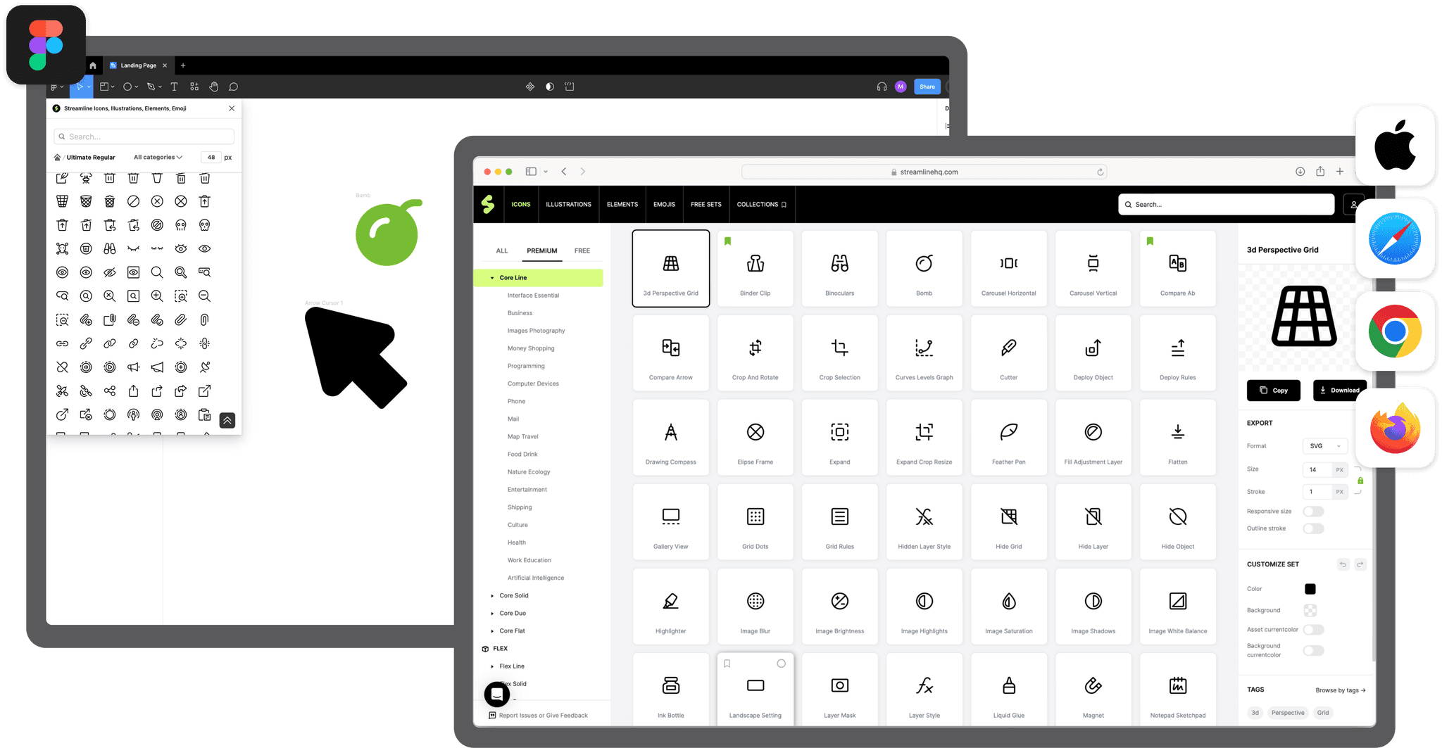
Add icons to a collection, so both designers and developers can easily pull either an SVG or JSX directly from a saved collection. Managing multiple projects? Use collections. Seeking smoother handoffs without the need for npm? Use collections.
Advantages of choosing React icons from Streamline
More (usable) choice
We consistently release new, massive icon sets and lead the trend. When others released a single Sharp icon set, we already had four variations of sharp icons. Because our sets are large, you don't have to mix and match inconsistent sets together.
Best React icons library
It's a big claim to make. At Streamline, each icon has been crafted over 12 years by a single team. Our customers have tried every alternative on the market and eventually gravitate to Streamline. It's simply hard to find icons as good as Streamline. Even our free sets have been voted as superior to the custom-made icons of billion-dollar companies.
Cleaner hand-off process
Add icons to a collection, so both designers and developers can easily pull either an SVG or JSX directly from a saved collection. Managing multiple projects? Use collections. Seeking smoother handoffs without the need for npm? Use collections.
Get more than icons for React
Discover our 180,000 icons system, meticulously designed with a consistent style by our team of eight icon designers. Streamline's sets are 50x larger than the industry average, covering every use case imaginable.
Get more than icons for React
Discover our 180,000 icons system, meticulously designed with a consistent style by our team of eight icon designers. Streamline's sets are 50x larger than the industry average, covering every use case imaginable.
Get more than icons for React
Discover our 180,000 icons system, meticulously designed with a consistent style by our team of eight icon designers. Streamline's sets are 50x larger than the industry average, covering every use case imaginable.
Streamline's React icons library is loved by millions of makers

“I use these icons for virtually every project. It's been a lifesaver. Never search for an icon again. You're welcome.”
BRETT @ DESIGNJOY
DESIGNER AND FOUNDER

“The streamline icon set saves me time and makes my designs more polished and more user friendly. It is worth every penny.”
LUCINDA BROWN
DIGITAL PRODUCT DESIGNER

“Streamline's icons are unique, versatile, and easy to work with. I've found them to be super useful across a range of projects.”
DANIEL BURKA
PRODUCT MANAGER AND DESIGNER
Streamline's React icons library is loved by millions of makers
“I use these icons for virtually every project. It's been a lifesaver. Never search for an icon again. You're welcome.”
BRETT @ DESIGNJOY
DESIGNER AND FOUNDER
“The streamline icon set saves me time and makes my designs more polished and more user friendly. It is worth every penny.”
LUCINDA BROWN
DIGITAL PRODUCT DESIGNER
“Streamline's icons are unique, versatile, and easy to work with. I've found them to be super useful across a range of projects.”
DANIEL BURKA
PRODUCT MANAGER AND DESIGNER
How to use React icons
Streamline offers the ideal solution for integrating high-quality icons into your React applications. Our main sets come in three styles—Light, Regular, Bold—and our specialized families like Plump, Flex, Sharp, and Core offer 16 variations, ensuring you always have the right style for your React components. All icons are consistently designed, fully customizable, and available in formats compatible with React and other popular frameworks. With Streamline, you not only enhance your React app's aesthetics but also ensure a seamless user experience and brand consistency. Whether you're a developer building single-page applications or a team crafting complex user interfaces, Streamline provides the efficiency and quality needed for top-notch React icons without design compromise.
npm React icons
Often, the go-to solution is an npm library, but this approach isn't without its drawbacks, from package bloat to potential compatibility issues. Streamline offers a unique and simpler solution: a vast React icon library with styles such as Line, Duo, Solid, and Flat. Instead of adding another dependency, you can just copy and paste the JSX code directly into your project. Our icon sets are 50 times larger than industry average, ensuring you always find the perfect icon for your needs. Though it might seem different from the typical npm install, this approach gives you the benefit of lighter, faster projects. Crafted with care over 12 years, these top-quality icons are easy to customize, scale, and seamlessly fit into any React UI, all while keeping your codebase lean and efficient. We get it – change can be a challenge, but with Streamline, you're choosing simplicity and quality.
FAQ
Is there a step-by-step guide for devs?
How do I drag and drop icons directly?
How to use react icons
How to install react icons
